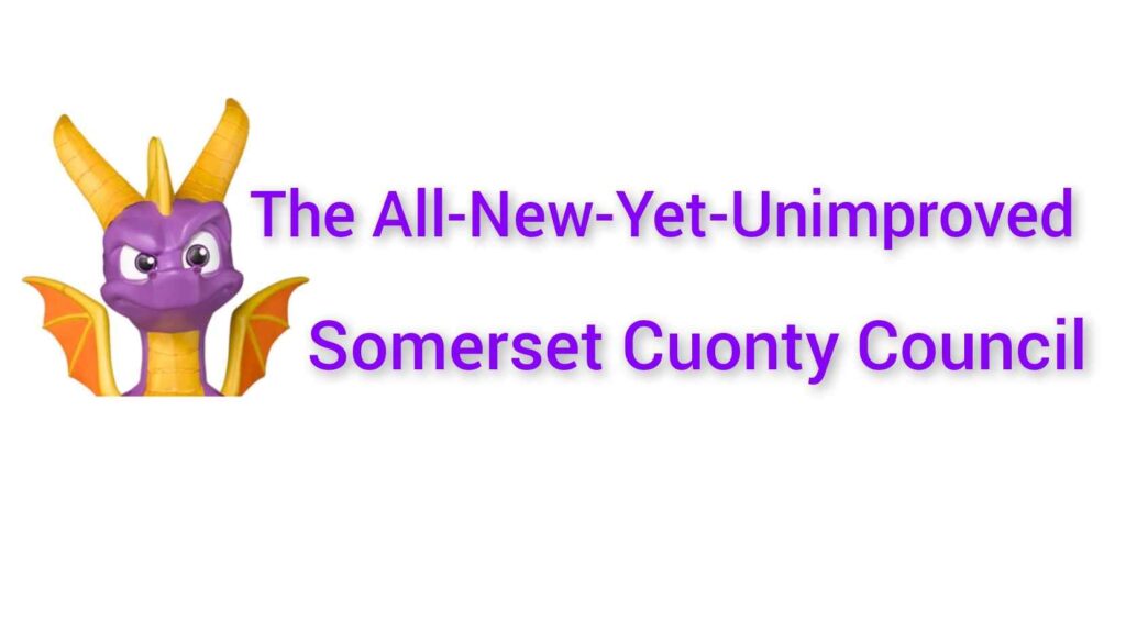
The All-New-Yet-Unimproved Somerset Cuonty Council has revealed their new look logo.
The new branding features an updated version of the Somerset Dragon from the county’s coat of arms and has been designed by the Council’s own graphics department to save costs.
Cllr Phill Crivens, Leader of the All-New-Yet-Unimproved Somerset Cuonty Council, said: “We obviously needed a pretty logo which sums up everything about your All-New-Yet-Unimproved Somerset Cuonty Council and I think our graphic designers have done a great job.
A dragon has been the symbol of Somerset since 1976, and this new version has two ears, two wings and a horn, which represent the main objectives of the council. The ears are there to show that we are listening, the wings represent our hopes to be able to fly away from any problems and the horn is a tribute to the former Vice Chair of Somerset Cuonty Council, Squire Teflon.”
However, SomersetClive readers have been in contact with us to say that the new logo bears an uncanny resemblance to the dragon from the popular video game ‘Pyro the Dragon’.
“Surely this is a joke?” said Arthur Brain, “That’s clearly Pyro the Dragon. Someone must be having a laugh. Although perhaps it’s a sign of thinks to come – a cartoon logo for a cartoon council.”
The brightly coloured dragon will soon become a feature of all Council communications so residents can look forward to seeing the image on their council tax bills.